
(Complete Guide for Beginners & Self-Published Authors)
Introduction
In today’s digital world, publishing a book has become easier than ever. Platforms like Amazon Kindle Direct Publishing allow authors to publish their work without needing a traditional publisher.
But there’s one major problem…
👉 Many authors focus only on writing and completely ignore book cover design mistakes.
And here’s the truth:
Readers DO judge a book by its cover.
Before someone reads your description or reviews, they see your cover first. If your cover doesn’t grab attention, your book may never get clicked — no matter how good your content is.
In this guide, you will learn:
- The most common book cover design mistakes
- Why they hurt your sales
- How to fix them easily
- Practical tips for better results
🎯 Why Book Cover Design Matters So Much

Your book cover is not just decoration — it is your first marketing tool. When readers browse online stores, they:
- scroll quickly
- look at covers
- click only on what attracts them
If your cover looks:
- unprofessional → they skip it
- confusing → they ignore it
- low quality → they don’t trust it
A strong cover can: ✔ increase clicks ✔ build trust ✔ improve sales
A weak cover leads to: ❌ poor visibility ❌ low engagement ❌ fewer sales
Expert book cover design is essential for success.
🚫 1. DIY Design Problems (Doing Everything Yourself)
The Problem
Many authors try to design their covers themselves using tools like Canva or Adobe Photoshop. While these tools are powerful, the problem is: 👉 Design is a skill — not just a tool.
Common Author Design Mistakes
- Poor alignment
- Random font choices
- Bad spacing
- Overcrowded layout
Real Impact
A DIY design without proper knowledge often looks: amateur, messy, unprofessional. This creates a bad first impression in the self-publishing world.
Solution
✔ Keep your design simple ✔ Use ready-made templates ✔ Study successful book covers
👉 Tip: If you're unsure, simple is always better than complex.
🎨 2. Wrong Fonts & Colors
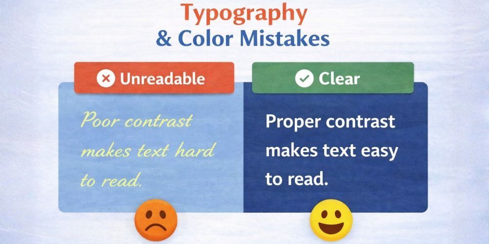
The Problem
Fonts and colors directly affect how readers feel about your book. Using the wrong combination creates a bad book cover design.
Common Mistakes
❌ Hard-to-read fonts: Fancy fonts may look stylish but are difficult to read. ❌ Too many fonts: Using 3–4 fonts makes your cover look chaotic. ❌ Poor color contrast: Dark text on a dark background = unreadable.
Example
- A horror book with bright pastel colors
- A competitive exam book with playful comic fonts
These confuse readers. Solution: ✔ Use maximum 1–2 fonts ✔ Choose clear, readable typography ✔ Match colors with your genre
📚 3. Genre Mismatch (One of the Biggest Mistakes)
The Problem
Your cover should instantly tell the reader: 👉 “What type of book is this?” If it doesn’t, readers feel confused and move on. Following standard layouts like Disha Publication helps avoid this.
Common Book Cover Mistakes
- Romance book with dark horror design
- Thriller book with cartoon graphics
- Self-help book with overly artistic design
Why It’s Dangerous: Attracts the wrong audience, Repels the right audience, Leads to poor reviews. Proper book editing and visual alignment are required.
Solution: ✔ Study top books in your genre ✔ Notice patterns in colors, fonts, and style ✔ Follow the same visual language
🖼️ 4. Low-Quality Images
The Problem
Using low-quality images is a major self publishing cover mistake. High-end production from Adhipati Creations prevents these issues.
Common Issues: Pixelated images, Blurry visuals, Stretched pictures, Visible watermarks. Result: Readers assume: 👉 “If the cover is low quality, the book will be too.”
Solution: ✔ Use high-resolution images (300 DPI) ✔ Avoid stretching images ✔ Use trusted stock image sources
📐 5. Poor Layout & Composition
The Problem
A bad layout ruins even good design elements. This is vital for marketing & promotions.
Common Mistakes
- Title not centered or balanced
- Text overlapping images
- Uneven spacing
- Elements placed randomly
Result: The cover looks: unorganized, confusing, unprofessional. Solution: ✔ Use alignment and grids ✔ Keep spacing consistent ✔ Balance text and visuals like Arihant Books.
🔍 6. Ignoring Thumbnail View
The Problem
Most readers see your book as a small thumbnail online. If your design doesn’t work at a small size, it fails. This is crucial for school books listings.
Common Mistakes: Tiny text, Too many details, Unclear title. Solution: ✔ Zoom out and test your cover ✔ Check mobile view ✔ Use bold and large typography.
📢 7. Weak Title Visibility
The Problem
Your title is the most important element on your cover. For Class 11 and other academic books, visibility is everything.
Mistakes: Title too small, Poor contrast with background, Hard-to-read font. Result: Readers cannot quickly understand what the book is about, which hurts sales of Class 12 resources.
Solution: ✔ Make the title big and clear ✔ Use contrast for visibility ✔ Avoid decorative fonts
🧠 8. Overcomplicating the Design
The Problem
Many authors think: 👉 “More elements = better design” But this leads to clutter. Read more on our blog.
Common Issues: Too many images, Too much text, No clear focus. Result: Readers feel overwhelmed and confused. Solution: ✔ Focus on one main visual ✔ Keep it clean and minimal ✔ Remove unnecessary elements
chart_with_downwards_trend; 9. Copying Other Book Covers
The Problem
Getting inspiration is good, but copying is a mistake. It affects ISBN & distribution originality.
Risks: Copyright issues, Lack of originality, Weak brand identity. Solution: ✔ Create a unique design ✔ Take inspiration, don’t copy ✔ Build your own visual style
💰 10. Not Investing in Professional Design
The Problem
Many authors avoid spending money on cover design. Refer to our plan and pricing for professional help.
Reality: Your cover is an investment, not an expense. Result of Ignoring It: Low sales, Poor branding, Weak market presence. Solution: ✔ Hire a freelance designer ✔ Review their portfolio ✔ Give clear instructions
📊 11. Not Testing Your Book Cover
The Problem: Publishing without feedback. Always consult with all authors in your network for feedback.
Solution: ✔ Ask friends or readers ✔ Run polls ✔ Test multiple designs
🎯 12. Ignoring Target Audience
The Problem
Your cover must match your audience’s expectations. Learn more about us and our design philosophy.
Example: Kids → colorful and fun, Business readers → clean and professional. Solution: ✔ Define your audience ✔ Understand their preferences ✔ Design accordingly
“A great cover gets attention. A great book keeps it.”
🏁 Conclusion
Your book cover is your first impression and strongest marketing tool. If you avoid these common book cover mistakes, you can: attract more readers, increase clicks, boost your sales.
Remember: A great cover gets attention. A great book keeps it.
🚀 Final Tip: Think of your book cover as your silent salesperson. If it looks professional and attractive, it will: 👉 bring readers to your book automatically