A Complete, In-Depth Guide for Authors, Publishers & Designers
Introduction: Why Book Cover Design Matters More Than Ever
A book cover is not just decoration-it’s a powerful marketing asset that communicates your book’s value within seconds. In both online marketplaces and physical bookstores, readers judge books by their covers—often subconsciously.
Think about it: when someone scrolls through hundreds of options on Amazon, what makes them stop? It’s not the description-it’s the cover design.
That’s why understanding the professional book cover design elements is essential. A well-crafted cover can:
- Increase clicks and sales
- Build trust and credibility
- Position your book within the right genre
- Create a strong first impression
In this extended guide, we’ll go deep into every aspect—from book cover typography to color psychology book cover strategies, ensuring you leave with zero doubts. Our self-publishing team follows these exact standards.
1. Title & Subtitle Placement (Deep Dive)
The title is your visual hook. If it fails, the entire cover fails—no matter how beautiful the design is.
📌 Advanced Title Placement Strategies
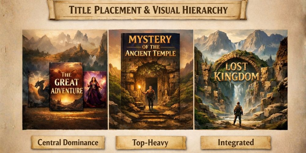
1. Central Dominance Layout
- Title placed in the center
- Works best for fiction and storytelling books
- Creates immediate focus
2. Top-Heavy Layout
- Title at the top, image below
- Common in nonfiction and self-help
3. Integrated Layout
- Title becomes part of the image
- Used in creative or artistic designs
📌 Subtitle Optimization
A subtitle is not just optional—it’s a conversion tool. It should: ✔ Explain what the book delivers ✔ Include SEO keywords ✔ Appeal to target audience. Professional book editing services ensure these are perfectly optimized.
Example:
Bad Subtitle: A Guide to Success
Good Subtitle: Proven Strategies to Build Wealth and Achieve Financial Freedom
📌 Spacing & Alignment
Proper spacing improves readability. Avoid cramming text and maintain margins for a clean look, just like the precise layouts in Disha Publication books.
📌 Pro Tip: Zoom out your cover to thumbnail size. If the title disappears or becomes unreadable, redesign it immediately.
2. Book Cover Typography (Advanced Concepts)
Typography is where design meets psychology. It influences how your book feels before it’s even read.
🔤 Font Pairing Techniques
Rule: Contrast + Harmony. Combine fonts that contrast but still look cohesive. Example Pairings: Serif + Sans-serif, Bold + Light, Script + Minimal. This balance is key in professional formatting.
🔤 Typography Hierarchy
Your text must guide the reader: Title (largest, boldest), Subtitle (supporting), Author name (least prominent unless famous).
🔤 Kerning, Tracking & Leading
These micro-details separate amateur from professional design: Kerning: Space between letters, Tracking: Overall spacing, Leading: Space between lines. Poor spacing = unprofessional look.
🔤 Emotional Impact of Fonts
- Serif: Trust, tradition
- Sans-serif: Modern, clarity
- Script: Elegance, romance
- Display: Creativity, excitement
🚫 Typography Mistakes to Avoid
Using trendy fonts that age quickly, over-stylized fonts that reduce readability, ignoring spacing, and using ALL CAPS excessively.
3. Color Psychology in Book Covers (Expert Level)
Colors are processed faster than text. That means your color choice instantly communicates mood and genre. We apply these principles to all Adhipati Creations titles.
🎨 Advanced Color Strategies
1. Monochromatic Design: Uses shades of one color, Clean, modern look. 2. Complementary Colors: Opposite colors on the color wheel, High contrast, eye-catching. 3. Analogous Colors: Colors next to each other, Harmonious and soothing.
🎨 Cultural Considerations
Color meanings vary by culture: White → purity (West), mourning (some Asian cultures); Red → danger (West), luck (India/China).
🎨 Genre-Based Color Trends
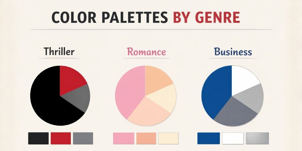
- Thriller → Black, red, dark blue
- Romance → Pink, purple, pastel
- Fantasy → Purple, gold, blue
- Business → Blue, white, grey
🎨 Practical Tips
✔ Test colors on different screens ✔ Use contrast for readability ✔ Avoid overly bright combinations. This level of detail is found in Arihant Books design.
4. Image & Layout Balance (Professional Techniques)
A balanced layout ensures your cover doesn’t feel chaotic or confusing.
🧩 Composition Techniques
✔Rule of Thirds: Divide the cover into a grid and place key elements strategically. ✔ Visual Flow: Guide the reader’s eye naturally: Top → Middle → Bottom. ✔ Layering: Use layers to create depth: Background, Midground, Foreground.
🧩 Image Selection Tips
✔ Use high-resolution images ✔ Avoid generic stock photos ✔ Match image tone with genre. This is crucial for effective marketing & promotions.
🧩 Minimalism vs Complexity
Minimal covers → modern, premium feel; Complex covers → detailed storytelling. Choose based on your genre, like the structured covers for school books.
5. Visual Storytelling Through Covers
A great cover tells a story without words. Ask yourself: What emotion should this evoke? Who is my target reader? What promise does the cover make? Example: A lonely road + dark sky → Mystery or thriller; A smiling couple → Romance.
6. Branding & Series Consistency
If you plan multiple books, consistency is key. Branding Elements: ✔ Same typography style ✔ Similar layout structure ✔ Consistent color themes. Example: Think of book series where every cover looks connected—even without reading the title. We ensure this for Class 11 and Class 12 academic sets.
7. Spine & Back Cover (Extended Guide)
📖 Spine Design Tips
Keep text readable, use contrasting colors, and add small design elements. 📖 Back Cover Essentials: Include Book description (hook-focused), Author bio, Reviews/testimonials, and Barcode. Check our ISBN & distribution guidelines for more details.
📖 Blurb Writing Tip
Start with a hook, not a summary. This is a common focus in our blog articles for authors.
8. Digital vs Print Cover Differences
📖 Digital Covers: Must look good in thumbnail; simpler designs work better. 📖 Print Covers: Include spine and back, need bleed margins, and higher resolution required. View our plan and pricing for these services.
9. Common Mistakes Authors Make
- ❌ Overcrowding: Too many elements confuse readers
- ❌ Ignoring Genre: A mismatch reduces trust
- ❌ Low-Quality Images: Instantly looks unprofessional
- ❌ Weak Typography: Hard to read = no sales
Many other authors emphasize avoiding these pitfalls.
10. Professional Book Cover Design Workflow
Step-by-Step Process: Research your genre → Define target audience → Choose color palette → Select fonts → Create layout → Add imagery → Test readability → Get feedback → Finalize design.
11. Tools & Resources (Detailed)
Beginner Tools: Canva, BookBrush. Advanced Tools: Adobe Photoshop, Adobe Illustrator, InDesign.
“A great cover doesn’t just look good—it sells the story before the first page is read.”
Conclusion
A book cover is a blend of art, psychology, and marketing. By mastering these book cover design guidelines for authors, you ensure your book stands out in a competitive market. At Adhipati Creations, we are committed to this excellence.
✔ Ready to turn your manuscript into a professional book?
Don't get lost in the confusion of the publishing world. Check our plan and pricing and contact Adhipati Creations today for a free consultation.
FAQs (Expanded Section)
For more specific details, visit our FAQ page.